Grid
Grids help to create a visually consistent experience across Workday products. At the foundation of layouts is the 12 column Canvas grid. Use this to guide your decisions when laying out content within your product.
Grid Anatomy

- Margins: The space at the outer edges of the grid, should always be of equal fixed width.
- Columns: Span the width of the content, use this to align your content correctly.
- Gutters: The space between columns that help separate content.
12 Column Grid
The Canvas grid system uses 12 columns. We chose the 12 column grid system because it is easy to divide 12 columns into halves, thirds, fourths, and sixths when designing for different screen sizes. We recommend reducing the number of columns as the screen width reduces as illustrated below. Check out our Responsive Layouts for recommended sizes.
Usage Guidance
The Grid system should be used when designing any layout within your product. If you think of your UI elements like blocks then these blocks can span across the 12 column grid in any number of ways as illustrated below. The 12 column grid system gives you a lot of flexibility when arranging UI elements.

Not all UI elements within your layout need to align with the column. As long as the parent element aligns to the assigned number of columns, that’s okay!

The cards within the above container do not need to align with the layout columns. You can use the 8pt grid to align the cards.
Responsive Layouts
Responsive layouts change the appearance of a layout, depending on the screen size and orientation of the device being used to view it. We recommend using the following grids to cater for these different screen sizes below.
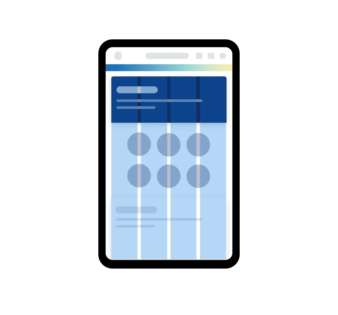
Small
320px - 767px
Number of columns: 4 Margins: 16px Gutter: 16px
Used for mobile size screens
To accommodate a 3 panel layout on mobile you can add a separate 12 column grid with a margin of 16px and gutter of 16px
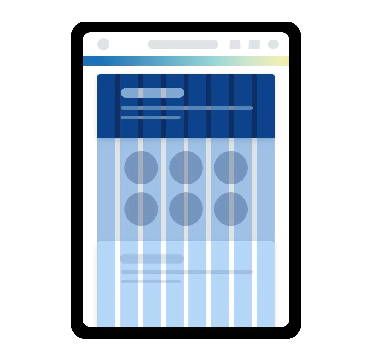
Medium
768px - 1023px
Number of columns: 8 Margins: 40px Gutter: 24px
Used for tablet size screens
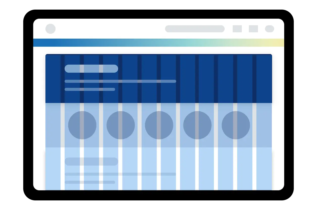
Large
1024px - 1439px
Number of columns: 12 Margins: 40px Gutter: 32px
Used for desktop and small laptop size screens
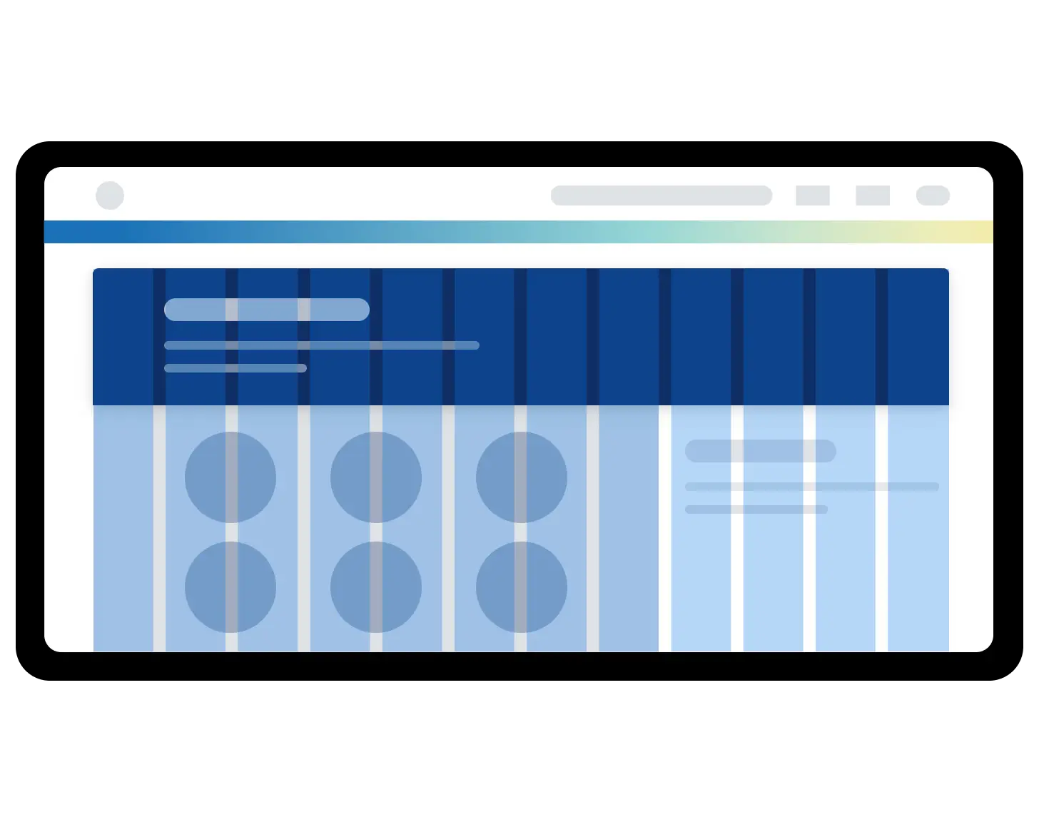
Extra Large
1440px+
Number of columns: 12 Margins: 80px Gutter: 40px
Used for large desktop size screens
For extra large screens we recommend that you apply a Max-Width of 1440px for the main page content.
| Breakpoint | Value | Columns | Margin | Gutter |
|---|---|---|---|---|
| Small | 320px | 4 | 16px | 16px |
| Medium | 768px | 8 | 40px | 24px |
| Large | 1024px | 12 | 40px | 32px |
| Extra Large | 1440px | 12 | 80px | 40px |
Layout Regions
Grids should always be used to layout your designs, even when working with different layout regions. Grids give you greater control over different regions and how you can position UI elements within your screen layout.

Main content region spanning across 12 columns

Multiple grids used to accommodate layouts with side panel regions

Grids used to accommodate layouts with left and right side panels regions that overlays the main page content
In the cases illustrated above, side panels can reduce the width of the main page content or overlay the page content. Grids of varying columns e.g 4, 8 or 12 can be used to accommodate your layout, but we recommend reducing the number of columns as the width decreases in order to prevent the layout becoming cluttered.
Density
The grid system can help you design for both high and low density layouts. The important thing to remember when working with density is to increase the margin and gutter space on high density layouts and decrease the margin and gutter space on low density layouts. This allows the user to easily scan groups of content.

Do
Increase the width of the gutters when laying out components with high density content.

Don't
Decrease the width of the gutters when laying out components with high density content.
When to Use
- To help you make decisions when designing high or low density layouts.
- Create visual hierarchy and rhythm in your layouts.
- Create consistent layouts across your product.
Examples
Basic Example
Note: We recommend you familiarize yourself with CSS Grid (MDN, CSS-Tricks) before diving into our
Gridcomponent. This example makes use of Grid Areas.
In this example, we set up a basic layout built with Grid using four child components: Header,
SideBar, BodyContent and Footer. By assigning the same names to each child’s gridArea prop,
we’re able to arrange them by referencing their names in the parent Grid container. Our example
uses a 12-column grid with SideBar occupying three columns and BodyContent occupying the
remaining nine.
Page Header
Main Content
import {Grid} from '@workday/canvas-kit-react/layout';
import {Heading} from '@workday/canvas-kit-react/text';
import {system} from '@workday/canvas-tokens-web';
import {createStyles, px2rem} from '@workday/canvas-kit-styling';

const containerStyles = createStyles({
  gridTemplateAreas:
    "'Header Header Header Header' 'SideBar BodyContent BodyContent BodyContent' 'Footer Footer Footer Footer'",
  gridGap: system.space.x4,
  gridTemplateColumns: '3fr 9fr',
  gridTemplateRows: `auto ${px2rem(300)} auto`,
});

const gridStyles = createStyles({
  backgroundColor: system.color.bg.primary.default,
  borderRadius: system.shape.x1,
  boxShadow: system.depth[1],
  padding: system.space.x4,
});

const headingStyles = createStyles({
  margin: system.space.zero,
  ...system.type.heading.small,
});

export default () => {
  return (
    <Grid cs={containerStyles}>
      <Grid as="header" gridArea="Header" cs={gridStyles}>
        <Heading variant="inverse" size="small" cs={headingStyles}>
          Page Header
        </Heading>
      </Grid>
      <Grid as="nav" gridArea="SideBar" cs={gridStyles}>
        <Heading variant="inverse" size="small" cs={headingStyles}>
          Navigation
        </Heading>
      </Grid>
      <Grid as="main" gridArea="BodyContent" cs={gridStyles}>
        <Heading variant="inverse" size="small" cs={headingStyles}>
          Main Content
        </Heading>
      </Grid>
      <Grid as="footer" gridArea="Footer" cs={gridStyles}>
        <Heading variant="inverse" size="small" cs={headingStyles}>
          Page Footer
        </Heading>
      </Grid>
    </Grid>
  );
};
Using Grid Items
In the example above we nested Grid components to create our layout, and we controlled the layout
structure from the top-level Grid container. We can also use Grid.Item components to allow child
cells to have more control. While any direct child of a Grid component is implicitly a grid item,
Grid.Item provides special CSS Grid Item style props that allow you to have more control over how
and where each item renders.
To demonstrate this behavior, the example below has a Grid container with nine cells. The eight
soap500 cells are Grid components, and the peach300 cell is a Grid.Item. We can use the
Grid.Item style props gridRowStart and gridColumnStart to manipulate where the cell renders.
Use the Row and Column buttons to manipulate these props and see the Grid.Item’s position
adjust accordingly.
Note: This example is solely intended to demonstrate
Grid.Item’s functionality and is not considered an accessibility best practice. Visually reordering content does not change the tab order or the order it is read in by a screen reader. Learn more about CSS Grid layout and accessibility.
import React, {useState, useEffect, useRef} from 'react';
import {Grid} from '@workday/canvas-kit-react/layout';
import {PrimaryButton} from '@workday/canvas-kit-react/button';
// eslint-disable-next-line no-duplicate-imports
import {
  arrowDownIcon,
  arrowLeftIcon,
  arrowRightIcon,
  arrowUpIcon,
} from '@workday/canvas-system-icons-web';

const Cell = (props: {children: React.ReactNode}) => {
  return (
    <Grid
      alignContent="center"
      padding="xs"
      justifyContent="center"
      backgroundColor="soap500"
      color="blackPepper500"
      borderRadius="m"
    >
      {props.children}
    </Grid>
  );
};

const CellItem = (props: {children: React.ReactNode}) => {
  return (
    <Grid
      alignContent="center"
      gridAutoColumns="max-content"
      gridGap="xs"
      height="100%"
      gridAutoFlow="column"
      padding="xs"
      justifyContent="center"
      backgroundColor="peach300"
      color="frenchVanilla100"
      borderRadius="m"
    >
      {props.children}
    </Grid>
  );
};

export default () => {
  const [rowCount, setRowCount] = useState(1);
  const [colCount, setColCount] = useState(1);

  const Prev = val => {
    const ref = useRef();
    useEffect(() => {
      ref.current = val;
    }, [val]);
    return ref.current;
  };

  const prevRowCount = Prev(rowCount);
  const prevColCount = Prev(colCount);

  const plusMinus = (curr, prev) => {
    if (curr <= 2 && (!prev || prev <= 2)) {
      return true;
    }
  };

  const incDec = (curr, prev, func) => {
    // eslint-disable-next-line @typescript-eslint/no-unused-expressions
    plusMinus(curr, prev) ? func(curr + 1) : func(curr - 1);
  };

  return (
    <Grid gridAutoFlow="row" padding="xs">
      <Grid
        gridTemplateColumns="repeat(3, 1fr)"
        gridTemplateRows="repeat(3, 1fr)"
        gridGap="xs"
        padding="xs"
        border="5px solid #c860d1"
      >
        <Grid.Item gridRowStart={rowCount} gridColumnStart={colCount}>
          <CellItem>
            <PrimaryButton
              size="extraSmall"
              icon={plusMinus(rowCount, prevRowCount) ? arrowDownIcon : arrowUpIcon}
              onClick={() => {
                incDec(rowCount, prevRowCount, setRowCount);
              }}
            >
              Row: {rowCount}
            </PrimaryButton>
            <PrimaryButton
              size="extraSmall"
              icon={plusMinus(colCount, prevColCount) ? arrowRightIcon : arrowLeftIcon}
              onClick={() => {
                incDec(colCount, prevColCount, setColCount);
              }}
            >
              Col: {colCount}
            </PrimaryButton>
          </CellItem>
        </Grid.Item>
        <Cell>2</Cell>
        <Cell>3</Cell>
        <Cell>4</Cell>
        <Cell>5</Cell>
        <Cell>6</Cell>
        <Cell>7</Cell>
        <Cell>8</Cell>
        <Cell>9</Cell>
      </Grid>
    </Grid>
  );
};
Let’s look at another Grid.Item example. Below, we have a Grid container with two rows: one with
seven elements and another with two elements. Each row is a Grid.Item that wraps a nested Grid.
This allows you to use Grid.Item to place a layout where needed. Here, we use gridRowStart to
place the row with elements 3 through 7 before the row with elements 1 and 2.
import * as React from 'react';
import {Box, Grid} from '@workday/canvas-kit-react/layout';

const Cell = (props: {children: React.ReactNode}) => {
  return (
    <Grid
      alignContent="center"
      padding="xs"
      justifyContent="center"
      backgroundColor="soap500"
      color="blackPepper500"
      borderRadius="m"
    >
      {props.children}
    </Grid>
  );
};

const CellItem = (props: {children: React.ReactNode}) => {
  return (
    <Grid
      alignContent="center"
      gridAutoColumns="max-content"
      height="100%"
      gridAutoFlow="column"
      padding="xs"
      justifyContent="center"
      backgroundColor="peach300"
      color="blackPepper500"
      borderRadius="m"
    >
      {props.children}
    </Grid>
  );
};

export default () => {
  return (
    <Box padding="xs">
      <Grid
        gridTemplateColumns="repeat(auto-fit, minmax(300px, 1fr))"
        padding="xxs"
        border="5px solid #c860d1"
        gridGap="xs"
      >
        <Grid.Item gridRowStart="2">
          <Grid gridTemplateColumns="repeat(auto-fit, minmax(300px, 1fr))" gridGap="xxs">
            <Cell>1</Cell>
            <Cell>2</Cell>
          </Grid>
        </Grid.Item>
        <Grid.Item gridRowStart="1">
          <Grid gridTemplateColumns="repeat(auto-fit, minmax(100px, 1fr))" gridGap="xxs">
            <CellItem>3</CellItem>
            <CellItem>4</CellItem>
            <CellItem>5</CellItem>
            <CellItem>6</CellItem>
            <CellItem>7</CellItem>
          </Grid>
        </Grid.Item>
      </Grid>
    </Box>
  );
};
Grid vs. Flex vs. Box
Grid and Flex are built on top of Box, so they have access to all BoxProps. Additionally,
Grid and Flex have their own specific style props that map to CSS Grid and Flexbox properties,
respectively. When using these components to build layouts, it is not a matter of choosing Grid
or Flex or Box, but rather deciding how to
use them together. They are intended to be
complementary not exclusionary. With that said, here are general guidelines for when to use which:
- Use
Gridfor two-dimensional layouts (rows AND columns). - Use
Flexfor one-dimensional layouts (a row OR a column). - Use
Boxfor generic containers that don’t need CSS Flexbox or Grid.
Component API
Grid
Grid is a container component for creating two-dimensional layouts with CSS Grid. It has special
style props that map to CSS Grid style properties to provide a common, ergonomic API for building
layouts.
<Grid gridTemplateColumns="1fr 2fr 1fr" gridGap={space.s}>
  <div>Implicit grid item 1</div>
  <div>Implicit grid item 2</div>
  <div>Implicit grid item 3</div>
</Grid>
Props
Grid exposes
grid container style props and Box
style props.
Grid.Item
Grid.Item is a subcomponent of Grid. It is a Box component under the hood and exposes
grid item style props that map to CSS
Grid Item properties. This provides greater control over how child components render in your layout.
<Grid gridGap={space.s}>
  <Grid.Item gridColumn="1 / span 2">First item</Grid.Item>
  <Grid.Item gridRow="1 / span 2">Second item</Grid.Item>
  <Grid.Item gridColumn="1 / span 2" gridRow="2">
    Third item
  </Grid.Item>
</Grid>
Props
Grid.Item exposes grid item style props and Box
style props.
Can't Find What You Need?
Check out our FAQ section which may help you find the information you're looking for. For further information, contact the #ask-canvas-design or #ask-canvas-kitchannels on Slack.